HatalyX · UA / HU / EN
What belongs on the first screen of a cottage website?
The first screen should explain what the accommodation is, where it is, who it suits and how to take the next step. Concrete answers are generally more useful than a long logo animation. This is design guidance, not a promise of a particular number of bookings.
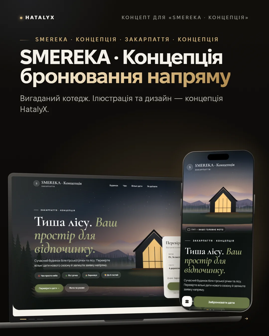
Make one specific offer
Alongside a broad promise of a great holiday, give the accommodation type, location and a real distinguishing feature. Mention capacity, a hot tub, pool or view only when accurate. Use your own photographs with permission. Label illustrations and fictional concepts clearly; never present another building as yours.
Make the button match the actual journey
For manually confirmed dates, use ‘Ask about availability’ or ‘Send an enquiry’. A completed form is a request, not an automatically confirmed reservation.
When a real availability system exists, guests can choose dates and see available rooms. Ari Zona is a working example. Keep demonstrated functionality and the scope of your own offer clear.
Explain the price and conditions
If you show a starting price, explain whether it is per room or whole cottage, for how many guests and for which period. State if dates affect the price. Guests should know deposit and cancellation conditions before committing.
Further down the page, show rooms, amenities, directions and common questions. Use only genuine reviews with any permissions needed for publication.
Try the complete flow on a phone
Can you read the heading and find the main action? Does a banner cover the button? Can you avoid horizontal scrolling? After submitting an enquiry, are the confirmation and expected reply clear? Test the whole guest journey.
HatalyX’s one-page Start package costs ₴9,900 without an admin panel or calendar. A booking system is a separate scope. Get a free concept within 24 hours and check the public prices. What a hotel website project includes is described separately.